Industry:
Prop Trading / Finance
Location:
Global
Service Provided:
Landing Page Design (UI/UX, CRO, Copywriting)
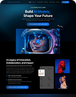
Before

After

The Challenge
Goat Funded Trader needed a bold, high-converting landing page to:
- Attract aspiring traders with clear offers and incentives
- Explain a complex multi-step challenge model simply
- Boost signups through trust, transparency, and benefits
- Stand out in a saturated prop trading space with clean design and concise copy
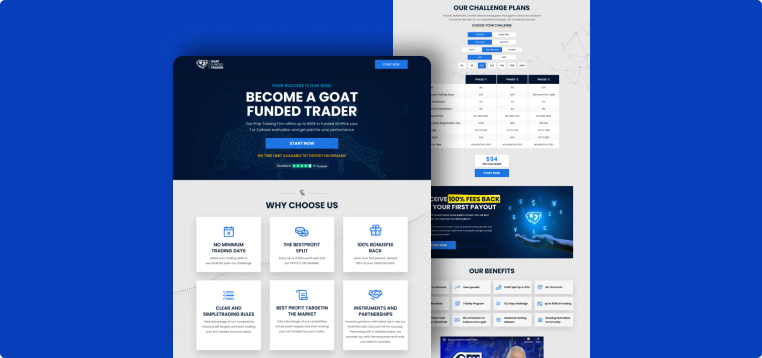
Our Solution
We designed a sleek, dark-themed landing page with a structured, high-trust format, including:
- Above-the-Fold Clarity
- Bold headline: “Become a GOAT Funded Trader”
- Subheadline breakdown of the program
- Primary CTA: “Start Now” placed in multiple visible areas
- Trust-Boosting Benefits Section<
- Icons + short copy on “No Minimum Trading Days,” “100% Bonus Back,” and “Clear Rules”
- Grouped in a clean 2-row layout for fast scanning
- Challenge Structure Simplified
- Step-by-step explanation: Evaluation → Verification → Funded
- Embedded 3-phase table comparing rules, profit targets, and drawdowns
- Social Proof & Visual Anchors
- Featured video testimonial with brand ambassador
- Rotating client reviews carousel
- Comparison table against competitors to establish superiority
- Conversion Drivers
- Bright CTAs (“Start Now”) at regular scroll intervals
- Bold pricing breakout with clear benefits (“$94 Evaluation – Start Now”)
- FAQ and Withdrawal-on-Demand to reduce buyer hesitation
Results
After launch, Goat Funded Trader saw measurable growth:
+63%
Challenge signups in the first 30 days
2.5x
Increase in scroll-through rates
41%
Lower bounce rate
18.7%
Mobile conversion rate
58%
Video engagement up
+78%
Increase in CTA click-through rate
REVIEW
What the Client Said

“The Ufrenza team nailed our vision. The landing page isn’t just pretty — it performs. Our conversions jumped instantly and users finally understand our offering. Can’t wait for the next one.”
Mr. Lorem Ipsum
CEO Goat Funded Trader