Updated: July 31, 2026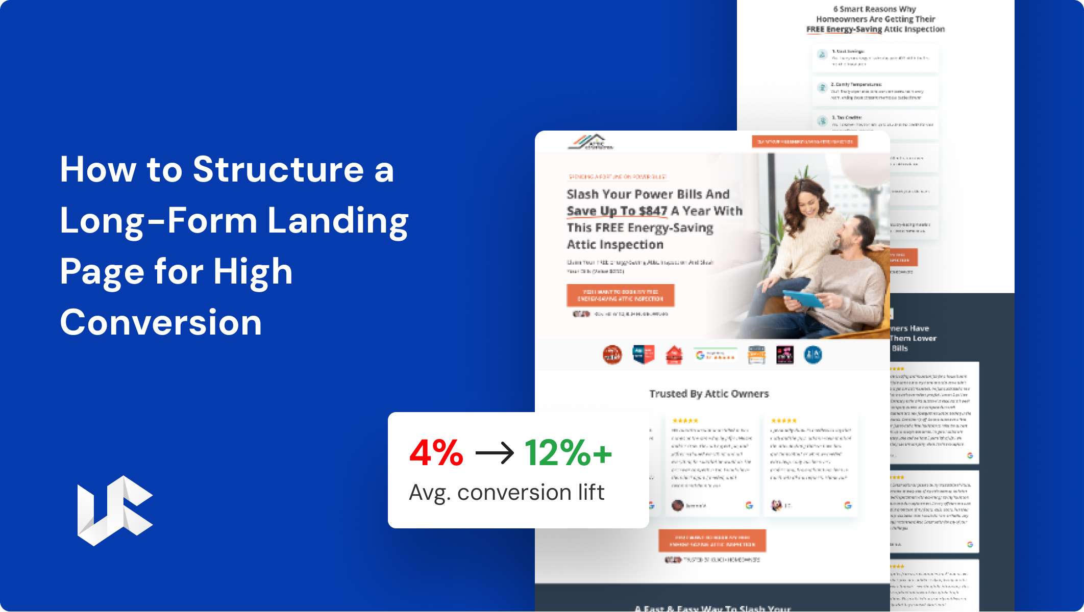
MAIN TOPIC
- What is a long-form landing page?
- When should you use a long-form landing page instead of a short one?
- What is the ideal long-form landing page structure?
- The hero section: your first five seconds
- The problem and solution sections
- The benefits section: features vs. outcomes
- Where should social proof go on a long-form landing page?
- How do you handle objections on a long-form landing page?
- The offer and risk-reversal sections
- Where should CTAs go and how many should you have?
- CTA button copy that converts
- How long should a long-form landing page be?
- How do you optimize a long-form landing page for mobile and speed?
- How do you measure and improve a long-form landing page?
A long-form landing page works best when it follows a clear flow that guides visitors step by step. It should include a hero section, problem, solution, benefits, social proof, objection handling, offer, and a closing CTA. The same primary call-to-action should appear every two or three sections, and the page should not have a navigation menu.
The goal is not to make the page longer. The goal is to organize the content in the right order. Every section should answer a question or remove a doubt so visitors feel confident enough to move to the next step.
In this guide, you’ll learn how to structure a long-form landing page for high conversion. We’ll explain each section, along with the best practices for layout, mobile optimization, and testing. Whether you’re promoting a high-ticket product or a complex service, this guide will help you build a landing page that increases trust and improves conversions.
What is a long-form landing page?
A long-form landing page is a single, standalone page created with one conversion goal. It uses a longer page to explain the value of your offer, build trust, answer common questions, and encourage visitors to take action. It works like a story. As visitors scroll down, they learn more about your offer and feel more confident, making the final call-to-action feel natural instead of pushy.
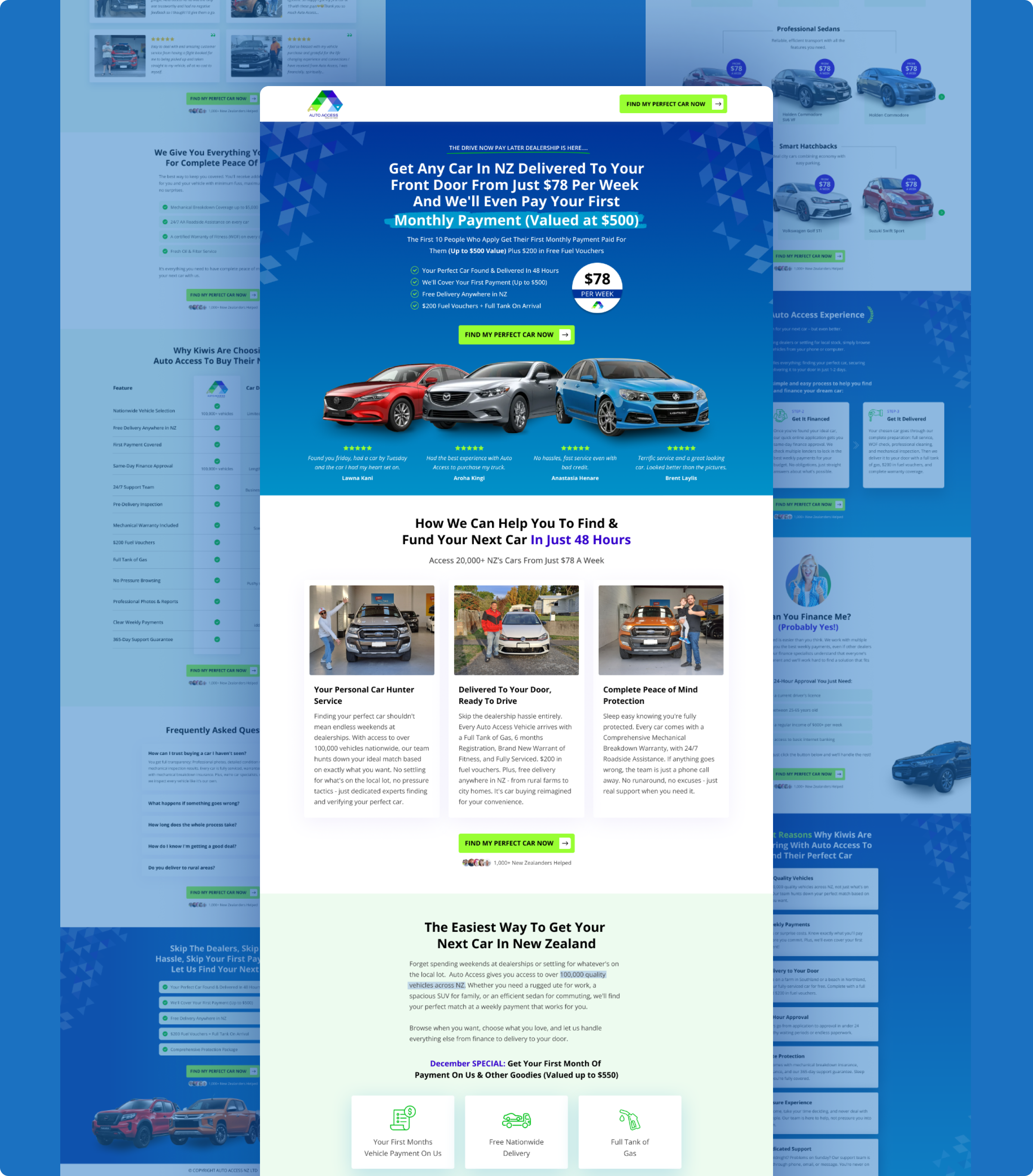
Two things make a long-form landing page different. The first is focus. There is no top navigation, no extra links, and no distractions. Every part of the page leads visitors toward one action. The second is depth. While a short-form landing page depends on a headline and a CTA button, a long-form landing page includes several sections that explain the offer because visitors need more information before making a decision.
Some landing pages can be very long. One well-known sales page is almost 30,000 words and sells a single $5,000 offer. Most landing pages don’t need to be that long, but the idea is the same: the bigger or more expensive the offer, the more information your landing page should provide.
When should you use a long-form landing page instead of a short one?
Use a long-form landing page when your offer is expensive, complex, or requires a big commitment. Use a short-form landing page when your offer is low-cost, simple, or free. The main difference depends on how many questions or doubts visitors have before they say “yes.”
A common marketing rule is that free offers usually work better with short copy, while paid offers often need longer copy. The more expensive the offer, the more information people usually need before making a decision.
For example, a $9 ebook needs very little explanation, so adding too much content can make people lose interest. On the other hand, a $5,000 course, enterprise software, or another high-value purchase needs a longer page because every unanswered question can stop someone from buying.
So, choose the length of your landing page based on how difficult the buying decision is, not on the number of words. A long-form landing page is not about adding unnecessary content. It is about giving visitors the information they need to feel confident before taking action.
What is the ideal long-form landing page structure?
The best long-form landing page follows a clear order from top to bottom. Each section has one purpose and helps move visitors closer to taking action.
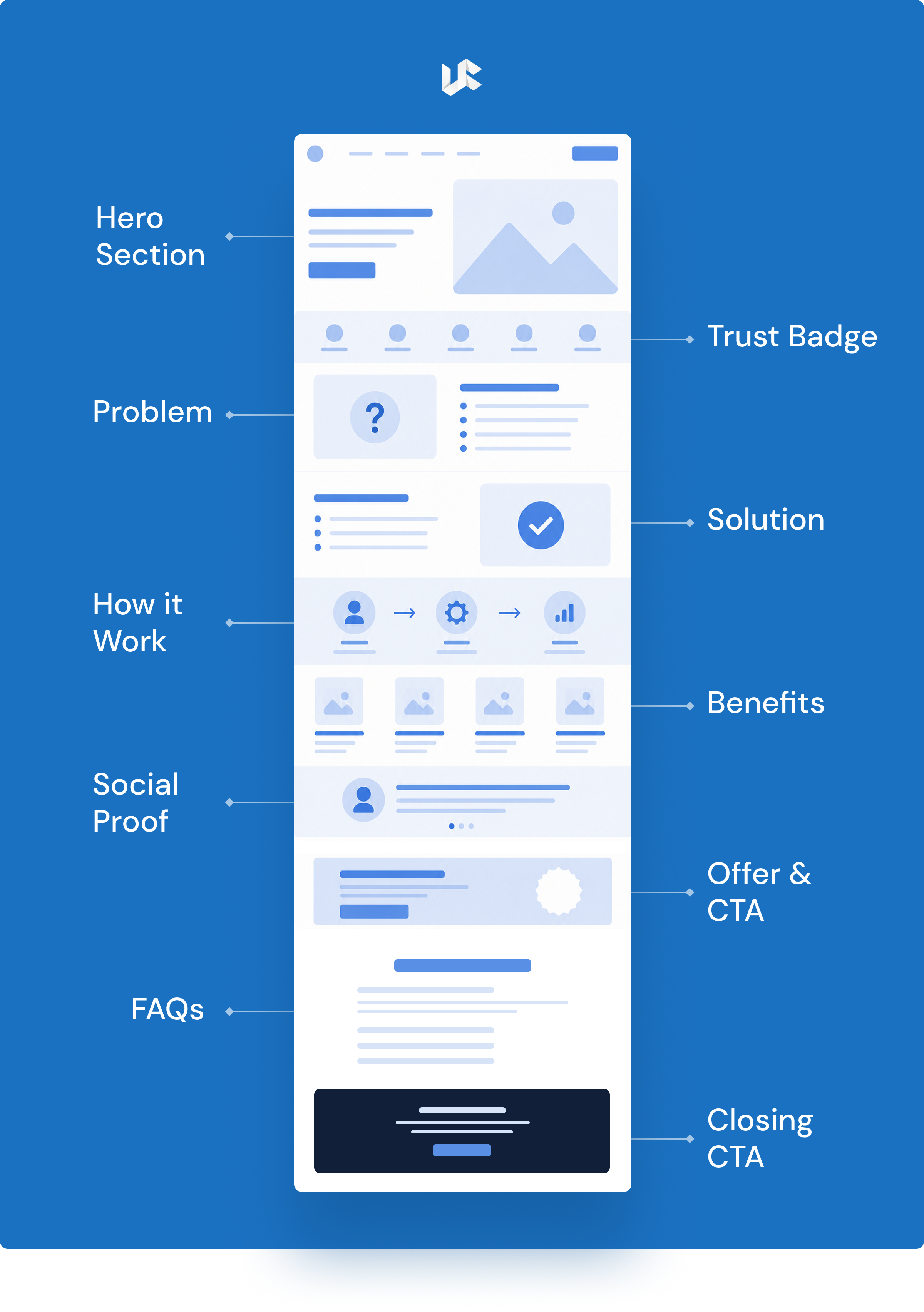
Hero:
Show the main result visitors can expect and include your primary CTA.
Problem:
Talk about the visitor’s problem using simple words they can relate to.
Solution:
Explain how your product or service solves that problem.
Benefits:
Show the results and value visitors will get, not just the features.
Social Proof:
Build trust with customer reviews, testimonials, ratings, or success stories.
How It Works:
Explain the process in simple steps so visitors know what to expect.
Objection Handling / FAQ:
Answer common questions and remove doubts that might stop visitors from converting.
Offer + Risk Reversal:
Clearly explain what visitors will get and reduce their risk with a guarantee, free trial, or refund policy.
Closing CTA:
End the page with a clear call-to-action for visitors who are ready to take the next step.
This order follows the way people make decisions, not the order of your product features. Visitors first need to understand that you know their problem. Then they need to trust your business through social proof.
Finally, they need to see the benefits before they are ready to accept your offer. If you ask them to take action too early, before they trust you, even a great offer may not convert. A well-structured long-form landing page guides visitors naturally from interest to action.
The hero section: your first five seconds
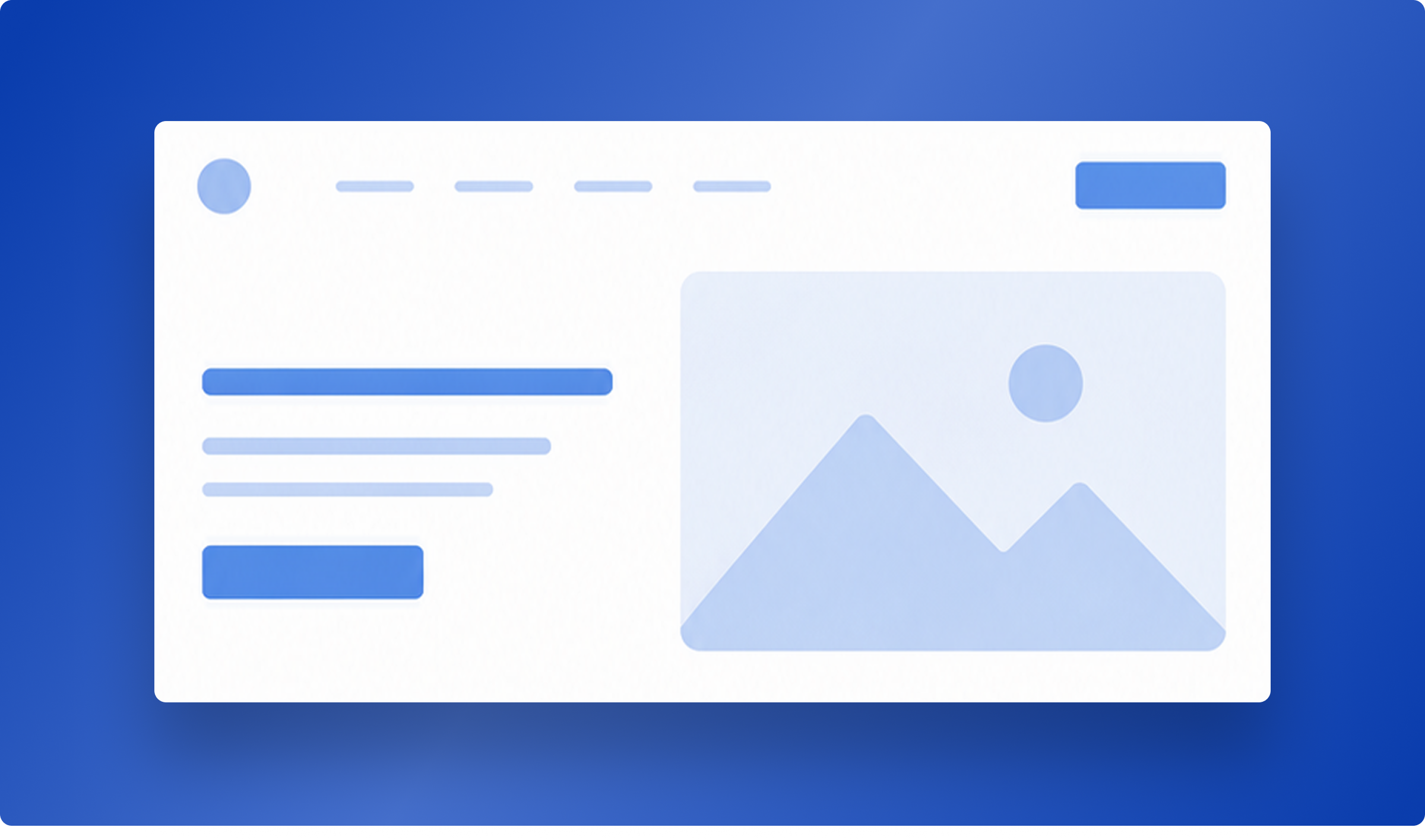
The hero section of a long-form landing page should have four important elements: a benefit-focused headline, a supporting subheadline, a relevant image or visual, and one clear CTA button. This section creates the first impression, and visitors usually decide within five seconds whether they want to keep reading.
Start with the result your visitors want, not your company name. For example, “Get 30% More Qualified Leads in 60 Days” is much stronger than “Welcome to Acme.” Make sure your hero section matches the message in your ad so visitors see the same promise after they click. If the message is different, many visitors will leave the page. Keep your headline short, around six to eight words, and add a trust signal such as “Used by 5,000 Teams” if you have one.
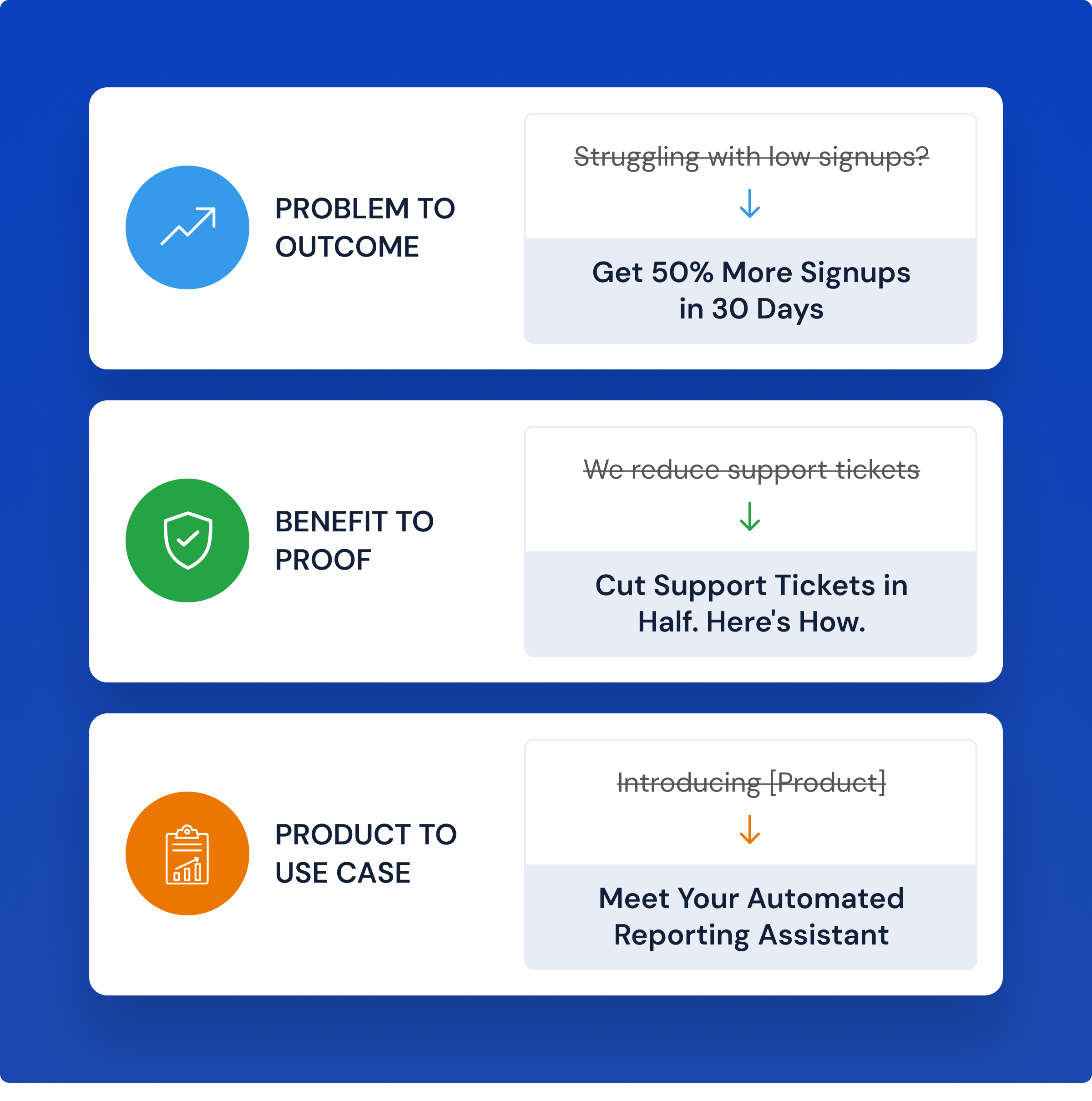
Always use simple language, include numbers when possible, and write the way your audience speaks. Clear headlines almost always perform better than clever ones.
The problem and solution sections
Right after the hero section, explain the main problem your visitors are facing. Use simple words they would use themselves instead of technical or industry terms. When visitors think, “That’s exactly my problem,” they are more likely to keep reading. If you jump straight from the hero section to product features, your landing page can feel generic and less convincing.
Next, explain how your product or service solves that problem. Keep it simple and direct. Tell visitors what your product does and how it helps them. Save the detailed features for later sections. At this stage, your goal is simply to connect the visitor’s problem with your solution and encourage them to continue reading.

The benefits section: features vs. outcomes
The benefits section explains how your features improve your customers’ lives or businesses. Every feature should answer one simple question: “What’s the benefit for me?”
For example, “Automated reporting” is a feature, but “Your weekly reports are ready before you start work on Monday” is the benefit. Visitors care more about the results they will get than the features themselves.
List three to five main benefits, and give each one its own heading. This makes your page easy to scan, even for visitors who don’t read every word.
Always connect each feature with a clear benefit. For example:
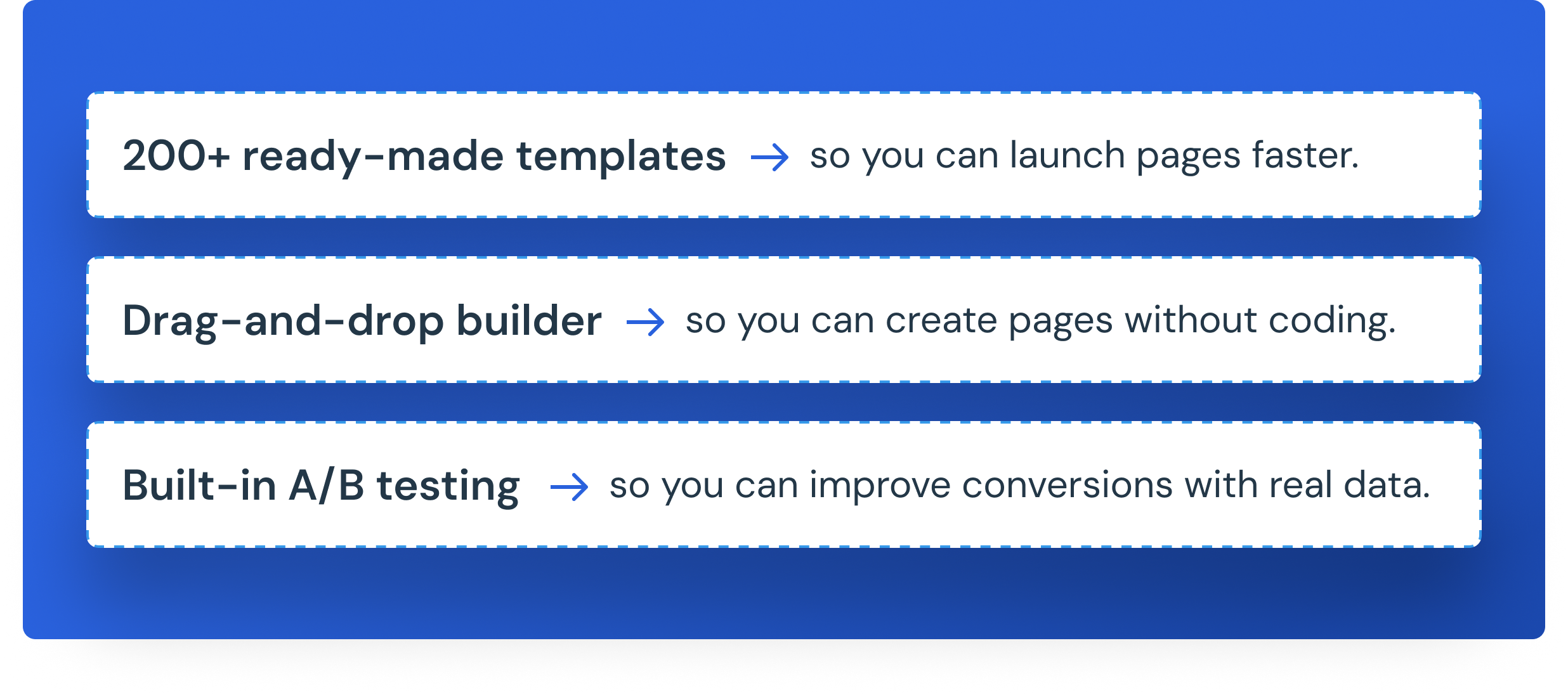
Instead of simply listing features, show visitors how those features help them achieve better results. Save the detailed explanation of how your product works for the next section.
Where should social proof go on a long-form landing page?
Social proof should appear early on your long-form landing page, right after the benefits section. You should also add it again near your CTA buttons because visitors need to trust you before they take action.
If you place all your social proof only at the bottom of the page, many visitors may leave before they ever see it.
The most effective types of social proof include:
- Customer testimonials with a real name, photo, or video — the most powerful because they show real people sharing real results.
- Company or media logos, such as “As Seen in Forbes” or logos of well-known clients.
- Ratings and reviews, such as “4.8/5 on Capterra.”
- Results and statistics, such as “120% increase in conversions” or “5,000+ pages created every month.”
No matter which type of social proof you use, it should always be real, specific, and relevant. General statements like “Trusted by many” are not very convincing. Real names, real numbers, and real customer experiences build much stronger trust
How do you handle objections on a long-form landing page?
Handle objections with a dedicated section that answers a visitor’s doubts before those doubts derail the conversion, because if you don’t answer their questions, they leave to find someone who will. On a high-ticket long-form page, this section is often what closes the sale.
Start with a short FAQ section that answers the most common questions, such as:
- How much does it cost?
- Is it secure?
- Do I need any technical skills?
- Will this work for a business like mine?
Keep each answer short, clear, and easy to read.
You should also build trust by including:
- A guarantee, such as “30-day money-back guarantee.”
- Low-risk offers, such as “No credit card required” or “Cancel anytime.”
- Security information, such as “Your data is protected with 256-bit encryption.”
- Compliance badges, such as GDPR Compliant or SOC 2 Certified, if they apply to your business.
Write your FAQs the same way your customers would ask them. This makes your page easier to read and helps visitors quickly find the answers they need.
The offer and risk-reversal sections
In the offer section, clearly explain what visitors will receive after they click your CTA. Include the price, what is included, how they will receive it, and any important deadlines. Visitors should never have to guess what they are buying. The clearer your offer is, the more likely people are to convert.
After explaining the offer, reduce the visitor’s risk by adding a risk-reversal section. This can include a money-back guarantee, a free trial, or a “Cancel Anytime” policy. These promises make visitors feel safer because they know they are not taking a big risk.
The more expensive your product or service is, the more important risk reversal becomes. A strong guarantee can give hesitant visitors the confidence they need to take the final step.
Where should CTAs go and how many should you have?
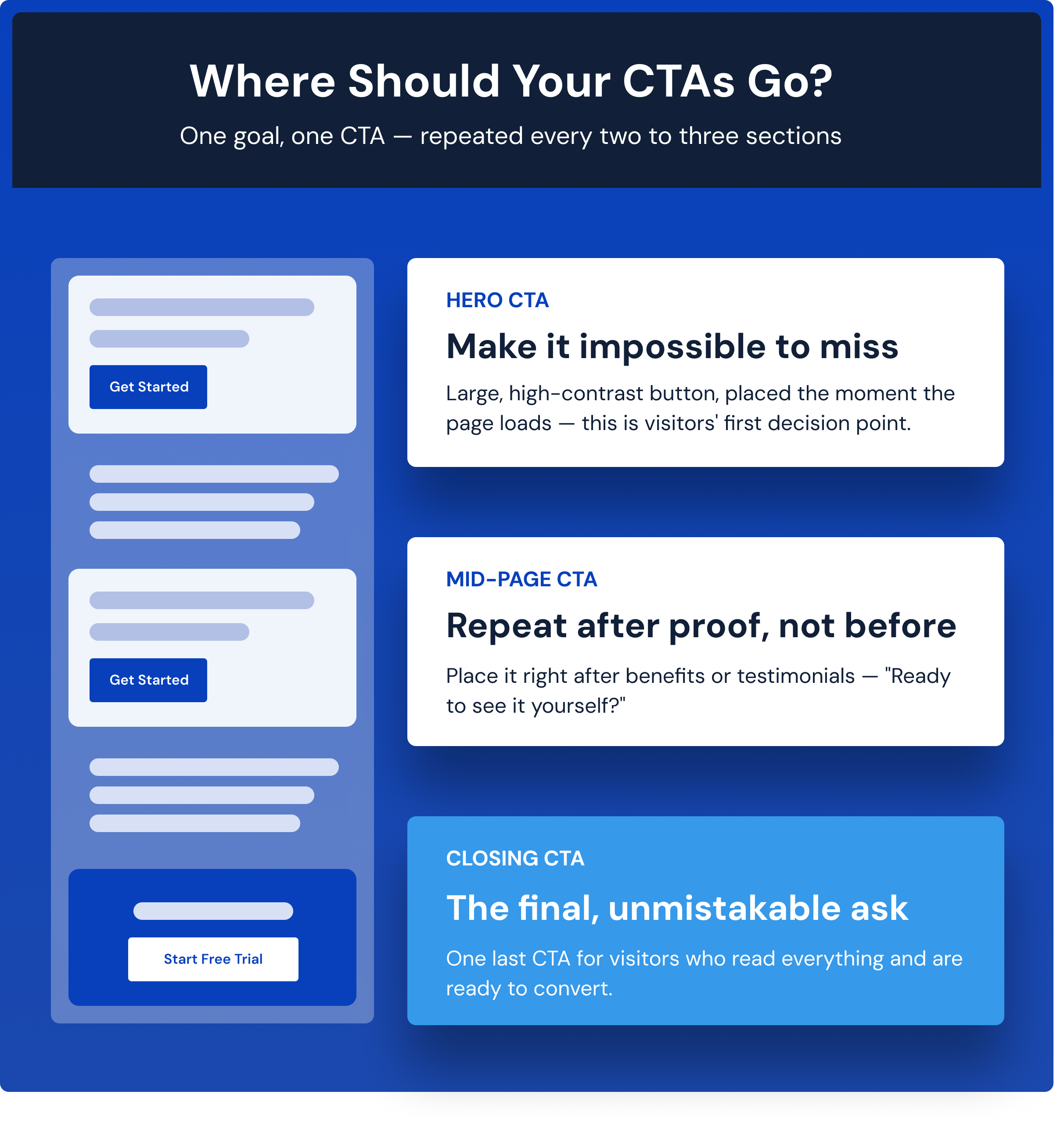
On a long-form landing page, use one main CTA and repeat it every two or three sections. Most landing pages have four to six CTA buttons, and every button should lead visitors to the same action.
People decide to take action at different points in their scroll, so using only one CTA may cause you to miss visitors who are ready earlier or later.
The simple rule is: one page, one goal, and multiple opportunities to take action.
- Hero CTA: Place your first CTA in the hero section. Make it large, easy to see, and use a color that stands out.
- Mid-page CTA: Add another CTA after an important section, such as the benefits or customer testimonials. For example, “Ready to See It Yourself?”
- Closing CTA: End the page with one final CTA for visitors who have read everything and are ready to convert.
Since long-form landing pages require more scrolling, a sticky header CTA or floating button can make it easier for visitors to take action at any time without scrolling back to the top.
Keep every CTA button consistent in design and message. They should all lead to the same goal. Avoid adding too many secondary CTAs that can distract visitors. Also, never end your landing page without a CTA, or you may lose visitors who are ready to convert.
CTA button copy that converts
Your CTA button text should be clear, action-focused, and written from the visitor’s point of view. Start with a strong action word and keep the text short, usually two to five words.
For example:
- Download My Free Guide is better than Download.
- Start My Free Trial is better than Submit.
- Book My Free Demo is better than Learn More.
If possible, add a short line below the CTA button to reduce hesitation. For example, “No Credit Card Required” or “Free Consultation – No Obligation.” Small trust messages like these can encourage more people to click.
Before publishing your landing page, ask yourself one simple question: Will a first-time visitor know exactly what will happen after clicking this button? If the answer is yes, your CTA is clear and effective.
How long should a long-form landing page be?
A long-form landing page should be only as long as it needs to be to answer your visitors’ questions and remove their doubts. The goal is not to make the page longer. The goal is to give visitors all the information they need before they take action.
For a complex or expensive offer, you may need 2,000 to 3,000+ words and all the important sections to build trust. For a simple or low-cost offer, a shorter page is usually enough.
A good way to check your page is to ask this question: Does this section help visitors make a decision? If the answer is no, remove it.
A long-form landing page works well because it provides useful information, not because it has more words. The real success comes from organizing the content in the right order so visitors get the answers they need at the right time.
How do you optimize a long-form landing page for mobile and speed?
Always design your long-form landing page with mobile users in mind. Most visitors browse on their phones, so your page should be easy to read, scroll, and use on smaller screens.
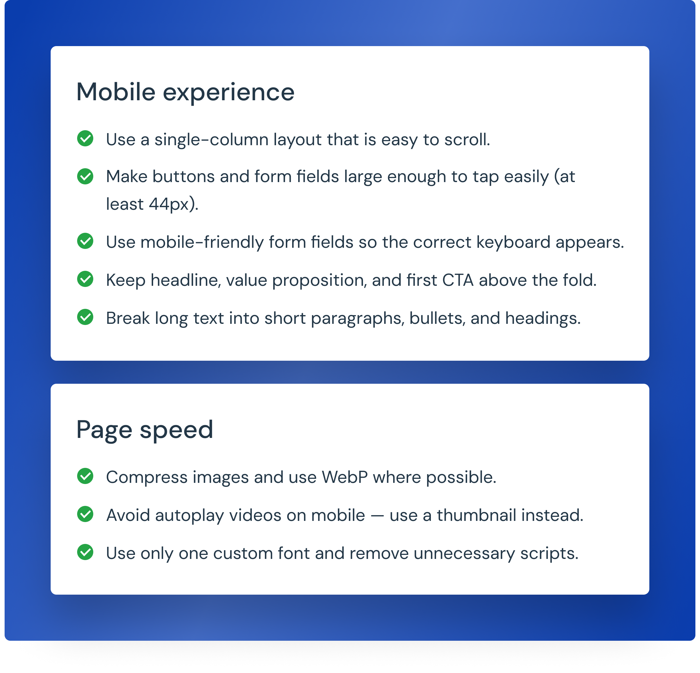
Even a one-second delay can reduce conversions, especially on a long landing page. After publishing, test your page on different phones and with slower internet connections to ensure everything loads correctly and there are no layout issues.
How do you measure and improve a long-form landing page?
To improve your long-form landing page, measure how visitors use the page and test changes one at a time. Since long pages have many sections, it’s important to know where visitors stop scrolling or leave the page.
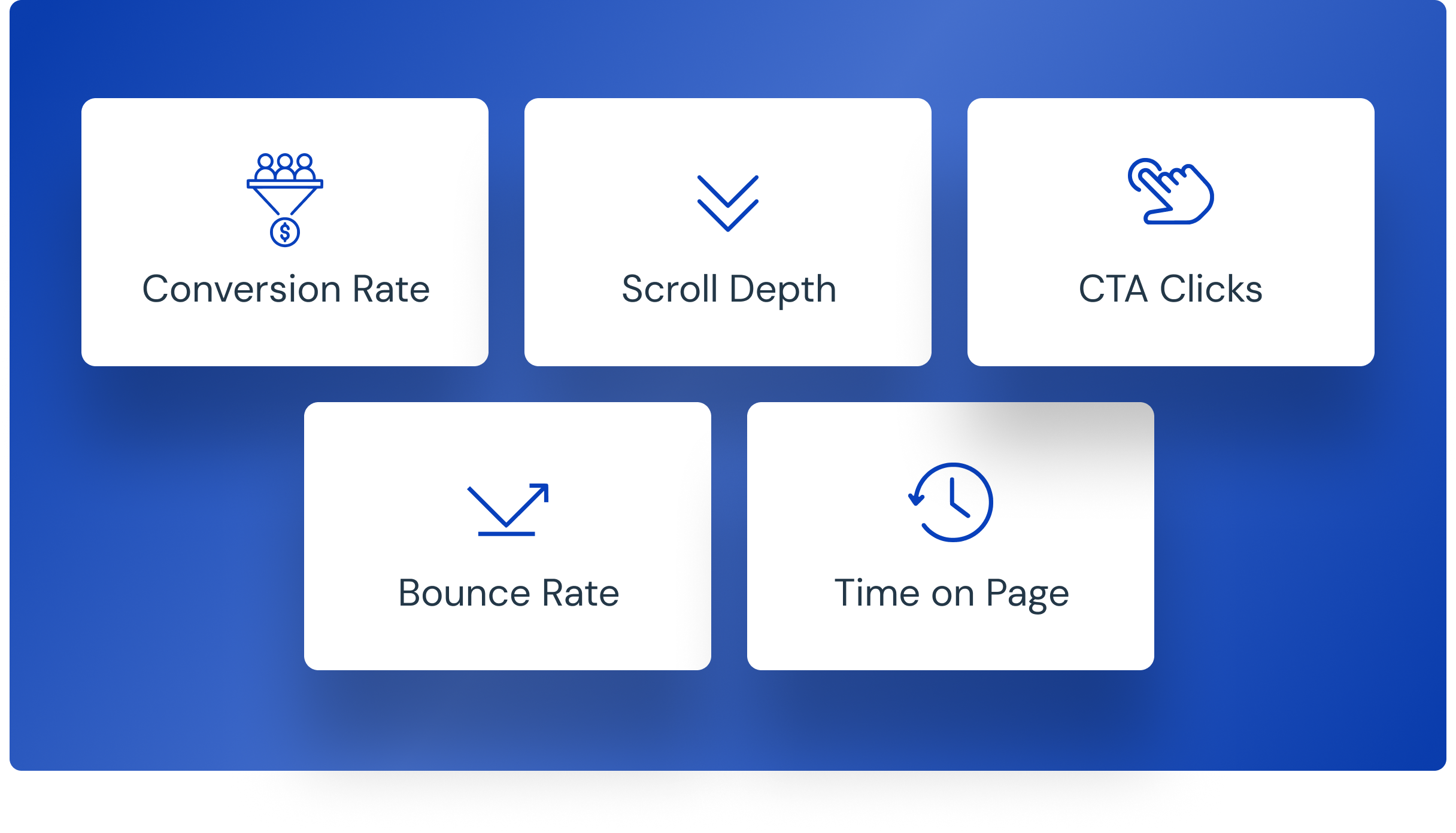
Track these important metrics:
- Conversion Rate: The percentage of visitors who complete your goal.
- Scroll Depth: How far visitors scroll down the page.
- CTA Clicks: Which CTA buttons get the most clicks.
- Bounce Rate: A high bounce rate may mean your headline is weak or your page loads slowly.
- Time on Page: Shows how long visitors stay and how engaged they are.
You can also use UTM parameters, Google Analytics, heatmaps, and session recordings to understand visitor behavior and find areas for improvement.
When testing your page, change only one element at a time, such as the headline, hero image, CTA placement, or section order. This helps you understand what improves conversions.
Finally, don’t focus only on getting more leads. Make sure those leads are high quality. A long-form landing page is never truly finished. Keep testing, making small improvements, and measuring results. Even a 1% increase in conversions can make a big difference over time.
Frequently Asked Questions
A good long-form landing page should follow this order: hero section, problem, solution, benefits, social proof, how it works, FAQs, risk-free offer, and a final CTA. This order helps visitors understand your offer, trust your brand, and take action.
A long-form landing page should be as long as needed to answer your visitors' questions. Expensive or complex offers may need 2,000–3,000+ words, while simple offers need much less. Focus on being helpful instead of hitting a word count.
Yes, for expensive or complex products and services. People need more information before making a big decision. For low-cost or free offers, a short-form landing page usually works better because it gets to the point faster.
Most long-form landing pages have four to six CTA buttons. Place one in the hero section, repeat it every few sections, and include one at the bottom. Every CTA should lead visitors to the same action.
Place the main CTA in the hero section so visitors see it right away. Repeat it throughout the page. If your offer requires more trust, use a button first and show the form later after you've explained the benefits.
Your page may not be converting because the headline doesn't match your ad, you focus on your company instead of the customer's problem, your proof comes too late, your CTA is hard to find, or the page includes unnecessary sections that don't help visitors make a decision.
Popular tools include Unbounce, Landingi, Leadpages, and Instapage because they offer templates, A/B testing, and easy editing. If you're on a budget, Carrd, MailerLite, and Hostinger are good choices. Choose a tool that is easy to use, works well on mobile, and lets you test different versions.
A high-converting landing page should include a strong headline, a clear problem, your solution, key benefits, customer reviews or testimonials, an explanation of how it works, FAQs, a risk-free offer or guarantee, and clear CTA buttons throughout the page.
Avoid using a weak headline, talking about your company before the customer's needs, hiding your CTA, adding too much unnecessary content, using too many menus, focusing on features instead of benefits, and making the page slow to load, especially on mobile devices.
Want a Long-Form Landing Page Built for You?
We've built 1,500+ landing pages and generated 10,000+ leads for our clients.
1,500+
Pages Built
10,000+
Leads Generated
4%→12%+
Conversion Lift
Conclusion
A long-form landing page is not about adding more content. It’s about giving visitors the information they need to say yes. Start with a strong hero section, explain the problem, present your solution, build trust with social proof, answer common questions, and end with a clear CTA.
Keep your page focused on one goal, make it mobile-friendly, and place your CTA throughout the page. After publishing, track your results, test one change at a time, and keep improving. Even small improvements can increase conversions over time. A simple, well-structured long-form landing page will always perform better than a long page with no clear purpose.
Also Check:
Microsite vs Landing Page: Know the DifferenceDo You Want More Conversions?
Discover how Ufrenza can help you with landing page and web design services. Contact us today!
Get Your Free Consult
ABOUT THE AUTHOR

Sheikh Zaid Nazir
Zaid Nazir is the founder and head of Ufrenza, a leading digital marketing and web design agency. With over a decade of experience in the industry, Zaid has driven the success and innovation at Ufrenza, guiding the team to create numerous impactful landing pages and generating over 10,000+ leads for clients worldwide.


 Read Time: 1 min