 Updated: May 15, 2026
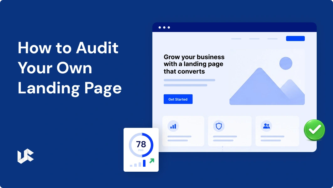
Before we redesign any landing page, we audit it. Every time, without exception.
It doesn’t matter how much experience we have or how obvious the problems might look at first glance. A structured audit forces you to look at a page systematically rather than reacting to what catches your eye. And nine times out of ten, it surfaces at least one issue that wouldn’t have come up otherwise.
This is the audit framework we’ve refined over hundreds of projects. You can run it on your own pages — it doesn’t require any special tools, just a willingness to look honestly at what’s in front of you.
Why Most 'Audits' Don't Help
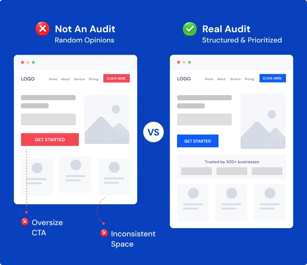
There’s a version of a landing page audit that goes something like this: someone glances at the page, says “the hero image doesn’t match the brand” or “the CTA should be a different color,” and calls it done.
That’s not an audit. That’s a design opinion.
A real audit looks at the page from the visitor’s perspective, examines each element against its specific job, and produces a prioritized list of changes based on what’s most likely to affect conversion. The goal isn’t to make the page look better — it’s to make it work better.
Those two things sometimes coincide. But they’re not the same.
Point 1: Message Match
Start before the page itself. Go back to the source of traffic — whether that’s a Google ad, a Facebook ad, an email, or a social post — and read what it says.
Now look at your landing page headline. Do they match?
Message match is the alignment between the promise made in the ad and the experience on the landing page. When they’re aligned, visitors feel like they’ve arrived in the right place. When they’re not, even a fraction of a second of confusion can send someone back.
Check: the specific words in your ad headline, the offer or benefit stated, and the tone. All three should carry through to the landing page.
Point 2: Clarity of the Value Proposition
Give your landing page to someone who’s never seen your business before. Ask them one question after 10 seconds: “What does this do, and who is it for?”
If they can’t answer that clearly, you have a clarity problem.
Your value proposition is the core argument for why someone should care about your page. It should appear in the headline or subheadline, in plain language, without jargon.
A weak value proposition sounds like: “We leverage innovative solutions to drive sustainable growth.” A strong one sounds like: “We design landing pages that convert more of your paid traffic into leads and customers.”
One is about you. The other is about the visitor. Only one earns attention.
Point 3: Above-the-Fold Content
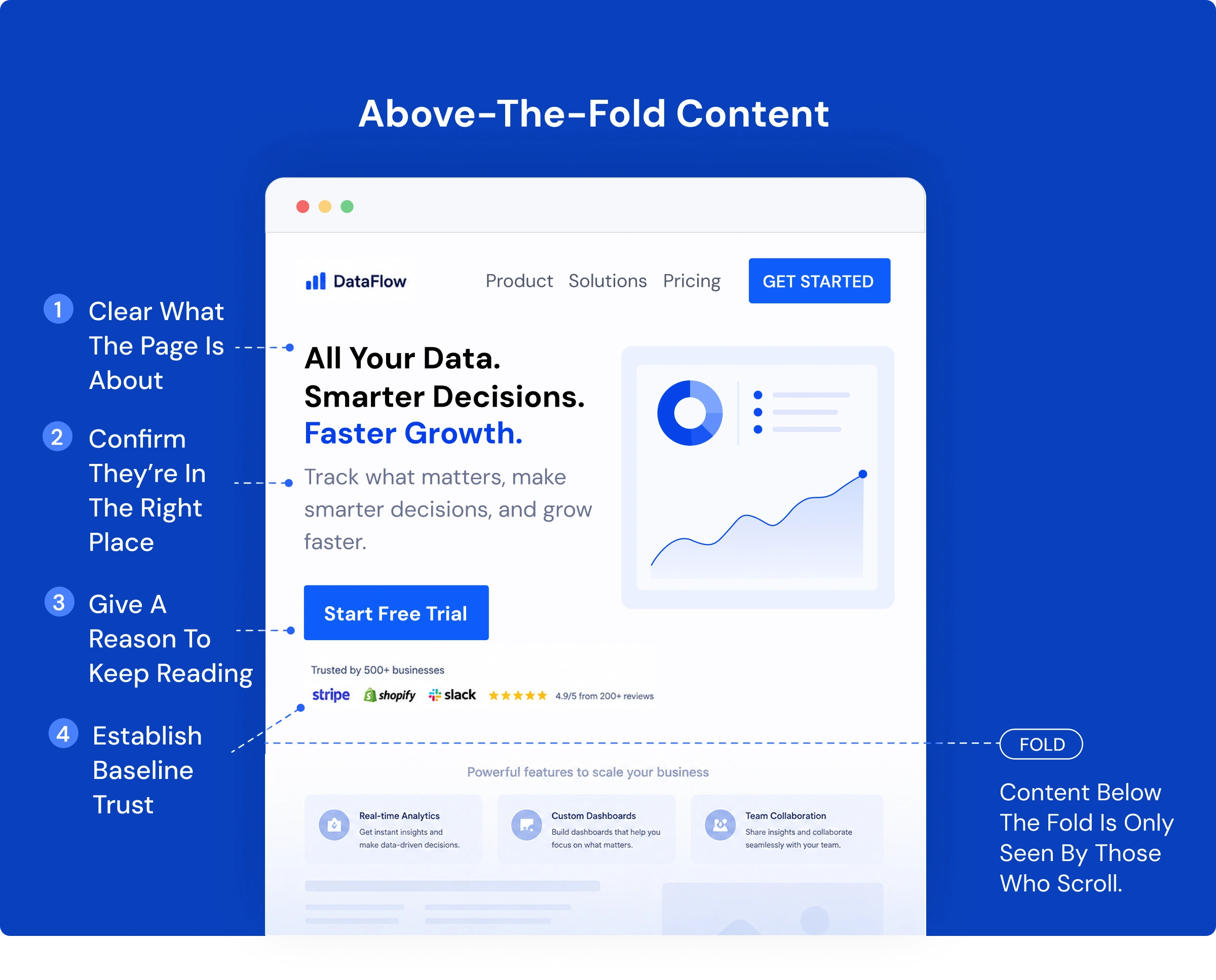
The “fold” is the point on the page where content disappears until the visitor scrolls. Everything above it gets seen by almost everyone. Everything below it only gets seen by the people who scroll — which is not everyone.
Your above-the-fold section needs to do four things simultaneously:
- Make clear what the page is about
- Confirm the visitor is in the right place
- Give a reason to keep reading
- Establish at least baseline trust
Look at your page with fresh eyes. Does the above-fold section accomplish all four? Most pages we audit accomplish two or three. Few do all four.
The trust signal in particular is often missing. Adding even a single piece of evidence above the fold — one client logo, one review, one “trusted by X businesses” line — can reduce the number of people who bounce before they read anything.
Point 4: The Single Conversion Goal
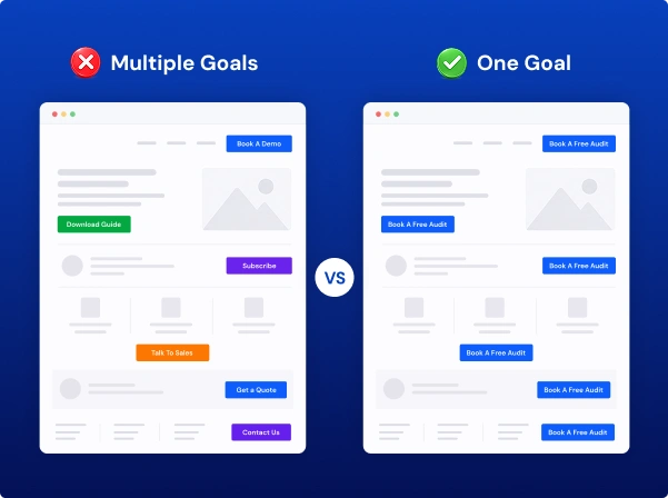
Count the number of distinct calls-to-action on your page. Not the number of buttons — the number of different things you’re asking visitors to do.
If the answer is more than one, you may have a problem.
Pages that ask visitors to both “Book a Demo” and “Download the Guide” and “Subscribe to the Newsletter” are distributing attention across three different conversion goals. Each one competes with the others, and the result is often that visitors do none of them.
A landing page should have one conversion goal. All other calls to action should either be removed or made clearly secondary.
Point 5: Social Proof — Quality, Specificity, and Placement
Run through every piece of social proof on your page and ask three questions about each one:
- Is it specific? “This team is fantastic” is weak. “We increased our conversion rate from 6% to 14% in 45 days” is strong. Numbers, timelines, and named results are what make testimonials credible rather than decorative.
- Is it from someone similar to your target visitor? A testimonial from a Fortune 500 CMO doesn’t help a small business owner feel confident. Match your social proof to your audience.
- Is it in the right place? Doubt doesn’t just happen once on a landing page — it comes up at different points as a visitor reads. Your strongest testimonials should be positioned near the moments of highest doubt, not saved for the end.
Point 6: The Form
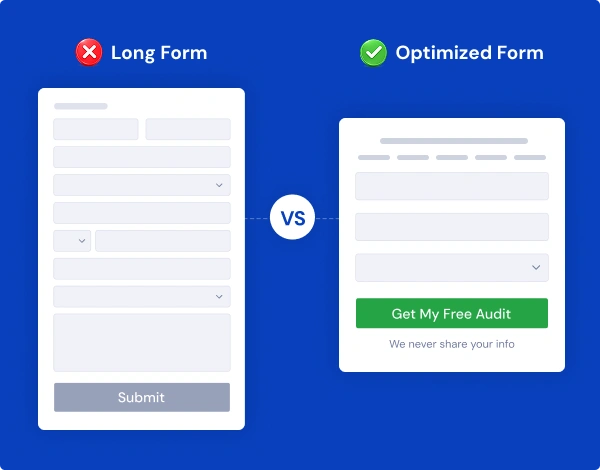
If your page has a form, give it a hard look.
How many fields does it have? Every field you add is a small barrier. Not a dealbreaker on its own, but they accumulate. If you’re asking for information you don’t strictly need at this stage — company size, job title, phone number when the conversion goal is an email — consider cutting it.
What does your submit button say? “Submit” is the least persuasive word you can put on a button. Replace it with something that describes what the visitor gets — “Get My Free Audit,” “Book My Spot,” “Send Me the Guide.”
Is there a privacy reassurance near the form? A single line — “We don’t share your information, ever” — can meaningfully reduce hesitation in visitors who are on the fence.
Point 7: Page Speed
This is the most technically oriented point, and it’s one of the most impactful.
Go to Google PageSpeed Insights (pagespeed.web.dev) and run your landing page URL. Look at the mobile score in particular.
A slow landing page doesn’t just frustrate visitors — it increases bounce rate, can affect your Quality Score in paid campaigns, and signals to Google that the page experience is poor.
The most common culprits we find: uncompressed images, too many third-party scripts, and no lazy loading on below-the-fold content. These are fixable, often without rebuilding anything.
A score below 70 on mobile should be treated as an urgent issue. A score below 50 is a serious problem that is likely costing you conversions every day.
Point 8: Mobile Experience
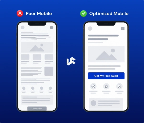
Load your page on your actual phone. Not in a browser’s mobile preview — on your real phone.
Then go through the page as a visitor would. Does the headline still read clearly? Does the CTA button appear without scrolling too far? Can you tap all the interactive elements without accidentally tapping the wrong thing? Does anything look broken or misaligned?
Mobile is not a “nice to have” audit step. With 80%+ of landing page traffic coming from mobile, a poor mobile experience is a broken landing page for the majority of your visitors.
Point 9: Objection Handling
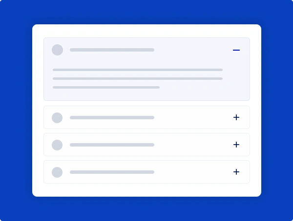
Make a list of every reason a qualified visitor might not convert. Price concerns. Uncertainty about whether the solution fits their situation. Questions about the process. Worries about commitment or risk.
Now go through your page and check: is each of those objections addressed somewhere?
Objections that aren’t handled become exit triggers. The visitor who leaves because they didn’t know whether there was a minimum contract isn’t won back — they go to your competitor’s page instead.
FAQs are one of the most underused tools on landing pages. A well-constructed FAQ section that addresses real concerns doesn’t just help visitors — it also helps with SEO, because FAQ content often matches the question-format queries that appear in Google search.
Point 10: The Thank-You Page
Most people forget about the thank-you page. It’s the page someone sees after they fill out your form or complete your conversion action — and it’s one of the most valuable real estate on your site.
Why? Because anyone who reaches the thank-you page is an extremely warm lead. They’ve already said yes to something. What do you want them to do next?
A well-designed thank-you page can invite them to book a call, follow you on social media, download an additional resource, or simply reinforce the decision they just made so they don’t experience buyer’s remorse.
A thank-you page that just says “Thanks, we’ll be in touch!” is a missed opportunity.
Turning the Audit Into Action
Once you’ve run through all ten points, you’ll likely have a list of issues. Some will feel urgent, some less so.
Prioritize by impact. Issues that affect every visitor — page speed, headline clarity, message match — should come first. Issues that only affect visitors who reach a specific section of the page come later.
Don’t try to fix everything at once. Pick the two or three changes most likely to move the needle and implement them first. Measure. Then move to the next round.
This iterative approach is how compounding conversion improvements happen. Not one big overhaul, but a series of targeted, tested changes over time.
When You Need a Professional Audit
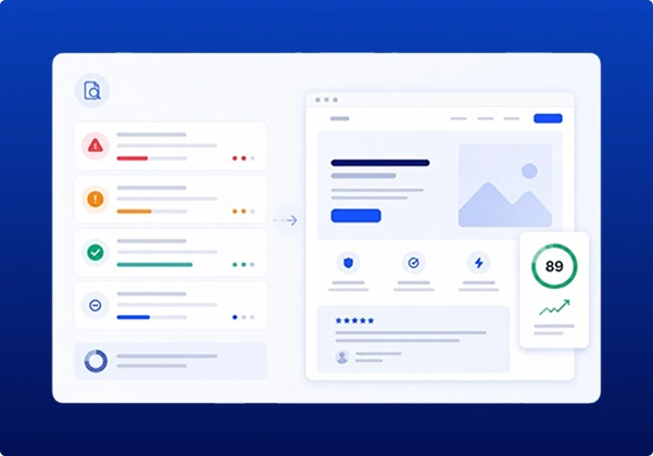
Running this audit yourself is valuable. But there’s a reason professional audits produce different results: a fresh pair of eyes, backed by pattern recognition from hundreds of similar projects, sees things that familiarity hides.
If you’ve worked on a page for weeks or months, your brain starts filling in gaps automatically. You read the headline as if it’s clear because you know what it means. A first-time visitor doesn’t have that context.
We offer a structured landing page audit service where we run through a detailed review of your page — design, copy, technical performance, conversion structure — and give you a prioritized report of what to change and why.
It’s one of the highest-leverage investments a business can make if they’re running paid traffic and not happy with their results.
Conclusion
By following these landing page do’s and don’ts, you can create high-converting landing pages that capture leads and customers and integrate seamlessly into your overall marketing strategy.
Remember, successful landing pages are a product of continuous learning, experimentation, and refinement. Always strive to improve your landing pages based on data and user feedback to maximize their conversion potential.
Let’s Get Started
It has survived not only five centuries, but also the leap into electronic typesetting, remaining
View More
ABOUT THE AUTHOR

Shekh Zaid Nazir
Zaid Nazir is the founder and head of Ufrenza, a leading digital marketing and web design agency. With over a decade of experience in the industry, Zaid has driven the success and innovation at Ufrenza, guiding the team to create numerous impactful landing pages and generating over 10,000+ leads for clients worldwide.


 Read Time: 1 min