Updated: May 15, 2026
MAIN TOPIC
We’ve built over 1,500 landing pages. Some of them performed exceptionally well. Some didn’t. And over time, we started noticing that the highest-performing ones weren’t the most elaborate — they were the most intentional.
This post is our attempt to document what we’ve learned. Not as a checklist of rules, but as a way of thinking about what a landing page is actually trying to do — and how great design serves that purpose.
First, What a Landing Page Is NOT
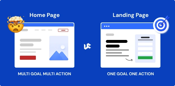
It’s not a homepage. It’s not a brochure. It’s not a place to tell your full brand story.
A landing page exists to do exactly one thing: move a specific visitor toward a specific action. Everything else is noise.
This distinction sounds simple, but it has enormous design implications. A homepage needs to serve many types of visitors with different needs. A landing page serves one type of visitor — usually someone who’s already shown intent by clicking an ad or a link — and its only job is to help them take the next step.
When you approach design with that clarity, a lot of decisions become easier.
The Structure That Works (And Why)
We’ve tested dozens of page structures over the years. Some were inspired by trends. Some by client requests. Some by our own experiments.
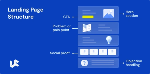
What keeps proving itself, across industries and campaign types, is a structure that follows the natural decision-making process of a visitor:
- Hero section — confirm they’re in the right place
The moment someone lands, they should be able to answer: *What is this? Is it for me?* Your headline, subheadline, and hero image need to do that work in under five seconds. Don’t make them hunt for it. - Problem or pain point — show you understand
Before you explain your solution, name the problem. Not in a vague way, but specifically. “Tired of landing pages that look great but don’t convert?” hits harder than “We help businesses grow.” When visitors feel understood, they read more carefully.
- The solution — what you do and how it work
Now introduce your offer. Be concrete. What will they get, how does it work, and how long does it take? People are more likely to move forward when they can picture the process clearly. - Social proof — borrow trust from others
This is where testimonials, client logos, case study results, and review ratings earn their place. Specific is always better than generic. “We saw a 43% increase in conversion rate in the first month” is more convincing than “Great team to work with!” - Objection handling — address the hesitation
Every visitor arrives with doubts. Price, time commitment, whether this is right for their industry, whether you’ll actually deliver. A good landing page anticipates these and handles them — through FAQs, guarantees, or the way you frame your offer. - The call to action — make it easy to say yes
The CTA should feel like the natural next step, not a leap. By the time someone reaches it, they should already be mostly convinced. The job of the CTA is to remove friction from the final decision, not to do the persuading.
The Design Decisions That Move Conversion Rates
Beyond structure, there are specific design choices we’ve found consistently affect performance.
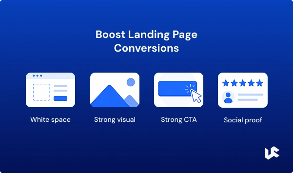
- White space is not wasted space
Designers sometimes get pushback on white space — clients feel like empty areas mean the page isn’t “full enough.” But white space is a tool. It guides the eye, creates emphasis, and reduces cognitive load. Pages that are visually cluttered force visitors to work harder to find what matters.
That effort costs conversions.Our rule: if a design element doesn’t serve the conversion goal, it doesn’t earn its place on the page.
- Images should do work, not just decorate
Stock photos of smiling people shaking hands. Abstract blue gradients. Exploding pie charts. These images are everywhere on landing pages, and they add almost nothing.The best images on a landing page either clarify the product (a screenshot, a demo video, a mockup), establish credibility (real clients, real results, real people), or create emotional resonance (showing someone in the situation your product resolves).
Before using any image, ask: *What does this tell the visitor that the words don’t?* If the answer is “nothing,” cut it.
- Social proof — borrow trust from others
Most people don’t think of font choice as a conversion factor. But the readability of your page — font size, line spacing, contrast — directly affects how long people spend reading and how much they absorb.We default to a comfortable minimum of 16px for body text, 1.6–1.8 line spacing, and high contrast between text and background. These aren’t design opinions — they’re accessibility standards that also happen to make pages easier to read and, by extension, more persuasive.
- The CTA button: color, size, and placement
Yes, button color matters. But not in the way most people think. It’s not that green converts better than blue, or orange beats red. What matters is contrast — the button needs to visually pop against whatever is behind it. Size matters too. A button should be large enough to tap easily on mobile, and prominent enough that a first-time visitor couldn’t miss it.When we review pages, we sometimes do a “squint test” — squint at the page and see if the CTA is still the most obvious thing. If it isn’t, it needs to change. Placement matters as much as appearance. We put CTAs in at least three places on a typical landing page: near the top, after the social proof section, and at the very bottom. Not everyone is ready to act at the same point in the page.
What the Data Tells Us
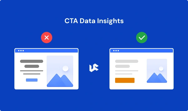
Yes, button color matters. But not in the way most people think. It’s not that green converts better than blue, or orange beats red. What matters is contrast — the button needs to visually pop against whatever is behind it.
Size matters too. A button should be large enough to tap easily on mobile, and prominent enough that a first-time visitor couldn’t miss it. When we review pages, we sometimes do a “squint test” — squint at the page and see if the CTA is still the most obvious thing. If it isn’t, it needs to change.
Placement matters as much as appearance. We put CTAs in at least three places on a typical landing page: near the top, after the social proof section, and at the very bottom. Not everyone is ready to act at the same point in the page.
Across our client projects, a few patterns show up consistently:
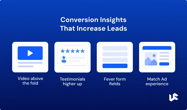
- Adding a video above the fold tends to increase time on page, which gives the rest of the content more chance to do its job. But autoplay with sound is almost universally disliked — use a thumbnail with a play button.
- Moving testimonials higher on the page has improved conversion rates in the majority of our A/B tests. Most pages put testimonials near the bottom. Moving a single specific testimonial — especially one with a result — to just below the hero section often has a noticeable impact.
- Reducing form fields almost always helps. For lead generation pages, we rarely include more than four fields. For pages targeting warm traffic, sometimes two is enough.
- Matching the page’s visual style to the ad that drove the traffic reduces bounce rate. If your ad features a specific image or color palette, carry that through to the landing page. Visitors should feel like they stayed in the same experience, not jumped somewhere new.
Industry-Specific Things That Matter
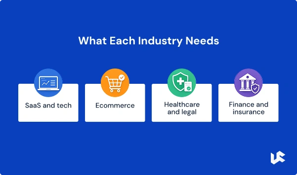
Design principles are universal. But the way you apply them varies by industry.
- SaaS and tech: Clarity is everything. Visitors are often technically sophisticated and suspicious of hype. Show the product, explain what it does, and lead with outcomes rather than features.
- Healthcare and legal: Trust signals carry extra weight. Credentials, certifications, regulatory compliance — these aren’t just nice to have, they’re decision factors. The design needs to feel professional and reassuring, not flashy..
- Ecommerce: Speed and mobile experience are the top priorities. Product images need to be crisp, the path to purchase needs to be as short as possible, and trust signals (reviews, secure checkout, easy returns) need to be visible.
- Finance and insurance: Visitors are cautious. The page needs to acknowledge risk and reduce it — through transparency, guarantees, and very clear explanations of what happens after they click.
Visitors are cautious. The page needs to acknowledge risk and reduce it — through transparency, guarantees, and very clear explanations of what happens after they click.
The Most Common Mistake We See
If we had to pick one thing that single-handedly hurts more landing pages than anything else, it would be this: trying to speak to everyone.
A page written for “businesses of all sizes looking to grow” is actually written for no one. The more specific and targeted the copy, the more a qualified visitor feels like the page is speaking directly to them — and the more likely they are to act.
The best clients we’ve worked with come in knowing exactly who their customer is, what that person is struggling with, and what would make them trust a solution enough to take action. When we build pages around that level of clarity, the results tend to reflect it.
Building vs. Hiring
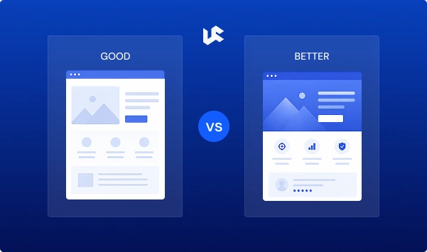
One question we get often: should you build a landing page yourself, or hire someone?
The honest answer depends on what you need. If you’re testing an early hypothesis on a tight budget, a well-structured page built on Unbounce or a similar tool can get you meaningful data. If you’re running paid traffic at scale, or if your campaigns need to compete in a market where quality and conversion rates really matter, the investment in professional design typically pays for itself quickly.
We’ve helped clients take pages from 4% conversion rates to 12% and above — not by doing anything exotic, but by applying the principles above with consistency and experience.
If you’d like to talk through what your specific situation calls for, we’re happy to do that. No obligation.
Conclusion
By following these landing page do’s and don’ts, you can create high-converting landing pages that capture leads and customers and integrate seamlessly into your overall marketing strategy.
Remember, successful landing pages are a product of continuous learning, experimentation, and refinement. Always strive to improve your landing pages based on data and user feedback to maximize their conversion potential.
Let’s Get Started
It has survived not only five centuries, but also the leap into electronic typesetting, remaining
View More
ABOUT THE AUTHOR

Sheikh Zaid Nazir
Zaid Nazir is the founder and head of Ufrenza, a leading digital marketing and web design agency. With over a decade of experience in the industry, Zaid has driven the success and innovation at Ufrenza, guiding the team to create numerous impactful landing pages and generating over 10,000+ leads for clients worldwide.


 Read Time: 1 min